")
")
Wall painting: transform your home with just color!
Whether you are moving into a new home, or want to refresh your space by painting and freshening up the walls, the choice of color is crucial.
For many, just the thought of painting their house seems like a mountain. And even though the place looks like it definitely needs painting and freshening up, they wonder "where do I start?" and "how to choose the right color?" for painting the walls.
In the event that you too are concerned about the choice of color for the walls of the house, then you must take into account a few things in order not to get lost in the color palette.
In our previous article we mentioned some elements of color theory. Here are basic guidelines to help you choose the right color for painting your walls, so that you have a beautiful result that will bring joy and rejuvenation to your space and life.
Wall Painting: Factors Affecting Color Selection
The lighting of the space
What kind of lighting is there in the space you want to paint? Large windows letting in natural light? Spotlights and hidden lighting? Multiple bulbs? How much light you have and where it comes from plays a decisive role in the choice of wall color. Sunlight is different for example in a north-facing room than in a west-facing room. Halogen lamps also give a different light than fluorescent lamps.
In any case, you can do a simple test to see how a color will look before you settle on painting the walls: Take a sample of the color you want to go over the walls and a large piece of cardboard. Paint the cardboard with two hands, with the color of your choice and support it against the wall you want to paint. Leave it there for a few days to see how it looks in natural or artificial light in the space at different times of the day.
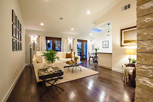
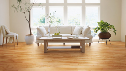
The floor
The floor of your space is the second largest surface in the room after the walls and to some extent, it will determine your color choices. Do you have a wooden floor in your space or are there tiles and colored carpets on the floor? The palette you choose must also include the color of the floor for a matching effect.
The windows and doors
The color of the windows and doors of the room (made of wood, white aluminum, etc.) must be calculated in the colors of the color palette that we will choose for a harmonious result. For example, shades of blue go very well with wooden elements.
Think about what you already have in place
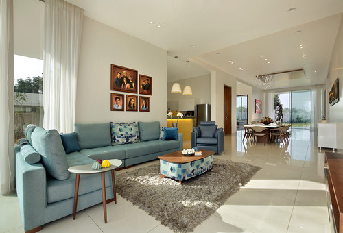
If you already have a separate element in the space that you want to paint, such as a piece of furniture, a rug or a piece of art, then you can choose a color for the walls from the palette of that element, either in a shade that gives a soft effect, or in a contrasting shade, for a more lively effect.
The use of space
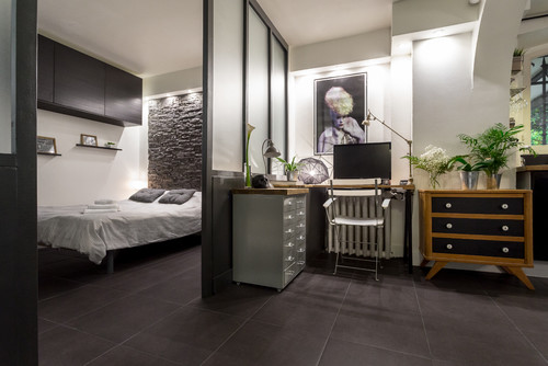
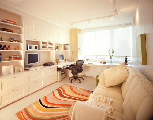
For rooms intended for rest and relaxation (bedrooms, study areas) colors that are not stimulating and cause a feeling of calm are ideal, such as neutral colors, very light shades and generally color combinations without strong contrasts. For the rooms that we want to be energetic and active (living rooms, dining rooms, kitchens, halls) we can use more intense color tones and color combinations with contrasts.
See the whole house as a whole
This does not mean that we should use the same color in all the rooms of the house, in order to have a single color set, even though it is a good aesthetic and financial proposition.

We can comfortably choose different colors in each room, but what interests us is that the color transition from one room to another flows smoothly, giving a harmonious and balanced whole. Especially if a room is visible from other rooms in the house, its colors must match the colors of the neighboring rooms. The options we have are many, as long as they obey the basic color rules proposed by the professionals in the field.
Wall painting : ideas for nice color combinations
You can get ideas for choosing a harmonious color scheme from many sources: from decorating magazines, from the Internet and decorating-related websites, as well as from the websites of paint companies that recommend ready-made color palettes. The proposals made by the professionals in the field are well thought out and can cover a wide range of needs and aesthetic preferences. Let's look at the most important ones:
a) Monochromatic palette
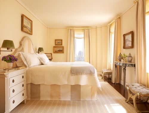
It is a series of colors consisting of the shades, tones and shadows of a single color. Such a color choice gives an elegant homogeneity to the space and an air of nobility, but in order not to have a monotonous effect you can play with textures and patterns in fabrics, carpets and objects. It is an ideal choice for small rooms because it makes them look bigger.
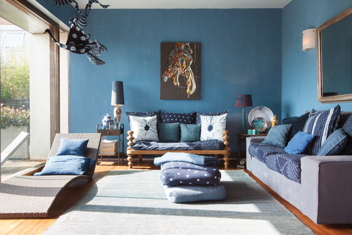
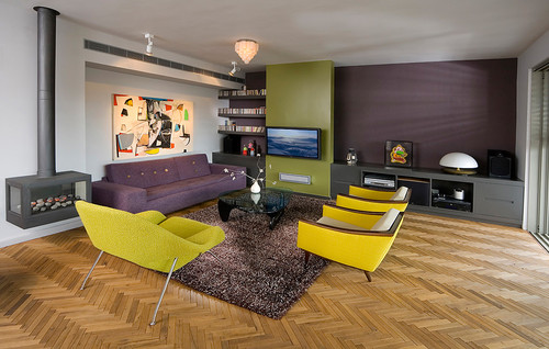
b) Bichrome or Trichrome: complementary colors
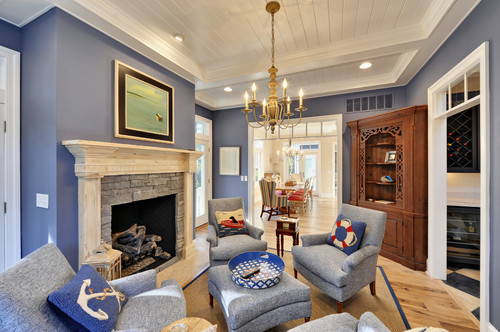
Complementary colors are directly opposite the primary color wheel (eg blue-orange, purple-yellow, green-red). As one is always warm and the other cold, when they are in the same space they create a sense of contrast and vitality, but also harmony. One complements the other and at the same time enriches the color of the other. That is why rooms with floors, doors, etc. made of blond wood look so beautiful in shades and tones of blue.
Depending on the use of the room, we can paint the walls with a warm or cool color and its complement can be included in decorative touches to give the intensity we want.
![]()
A variant of the pair of two complementary colors is the "broken" complementary palette consisting of 3 colors: one color and the two colors to the left and right of its complementary (eg purple - yellow-green - yellow-orange).
c) Bichrome or Trichrome: analog palette
The 2-3 colors that are next to each other on the color wheel are named proportionally, they fit harmoniously with each other and give a calm and relaxing effect, without contrasts (eg yellow - yellow-orange - orange or blue - teal - green). They can be combined both in the same room and in neighboring rooms.
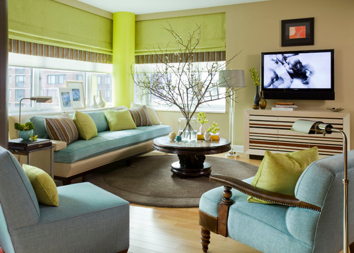
Depending on the use of the room and the lighting, we can have a warm or a cold analog palette. For a soft effect, without big contrasts, paint the walls in the lightest color of the palette.
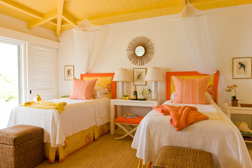
d) Tricolor: ternary palette
Triad colors are at the edges of an equilateral triangle on the color wheel, i.e. they are equidistant from each other (eg red, yellow, blue). They produce a very lively and intense color effect, so you need to pay attention to which tones of colors you will choose and in which proportions they will enter the space. They suit spaces - and people - with a strong personality or spaces with a youthful mood.

Painting walls: how much paint and where?
Of the 2-4 colors that the palette you choose will have (light, medium, dark) the mildest result is achieved if you paint the walls in the lightest color, then the medium color is on the floor, curtains, wallpapers of the furniture and the darkest color in the decorative details, vases, paintings, pillows, etc.
Of course, this rule is not absolute, because your choices depend on the color of the elements of the space you already have and which, as we said above, must be taken into account. If for example you have a very dark floor, then the decorative items can be the light or medium color.
In decoration, a rule that works to achieve a harmonious overall effect is the so-called "golden ratio" which is the "60-30-10" rule.
If we consider the color of the walls to dominate 60% of the space, then the color of the floor and the fabrics must make up 30% of the color of the space, i.e. half of the wall and the decorative items (vases, lamps, etc.) ) 10% of the space color.
Finally, touches of white or black, which are considered non-colors and go with everything, can lighten or darken the space and tie the composition together.
Master's technical team is at your disposal to give you advice and help you choose colors for painting your space. You can contact us to come to your place for free and give you an oil painting quote.